medical guardian | set-up webpage design
Creating a device-activation page to facilitate efficient set-up of Medical Guardians’ medical life alert devices
overview
Medical Guardian is one of the leading providers of medical life alert (MLA) systems. Medical Guardian offers several options for on-the-go and in-the home monitoring for falls and other emergencies, keeping loved ones safe and providing peace of mind for caregivers. For this speculative project, my team created a brand new set-up web page for activation of all of Medical Guardian’s medical life alert devices.
The goal of this web page is to facilitate users’ set-up process, creating less opportunities for abandoning the device and instead allow users to successfully and confidently utilize their device successfully.
timeline
2 weeks
role
Lead UX designer, UX researcher, web accessibility specialist
tools
Figma, FigJam, Google Slides, Google Sheets, Zoom, Pen & Paper
1
what’s the issue with medical guardian?
According to the brief, Medical Guardian wanted to enhance their product offerings and delivery of services. Based on data on how, when, where, and why their devices are used, Medical Guardian reported only 80% of purchased MLA devices were activated.
Our team sought to understand this key dilemma on why customers purchased medical life alert systems but abandoned them during the activation process.
how does medical guardian compare?
Comprehensive site audits of Medical Guardian and its competitors (e.g, Lively, Philips Lifeline, Mobile Help, Bay Alarm Medical) were conducted by my team members. We all participated in conducting secondary research through researching consumer reports, Amazon and Youtube reviews, and direct informational calls to companies.
Surveys and qualitative interviews of users of MLA systems and/or their caretakers provided in-depth information and anecdotes on individual MLA activation processes. Through these modes of research, the most pertinent themes regarding MLA device activation were discovered.
Key user research takeaways:
MLA devices generally increase the user and their guardian’s quality of life (e.g., several users mentioned that MLA devices contributed to “peace of mind”).
Customers with successful device activations generally received outside assistance (e.g., customer service, caretaker, etc.).
Customer service is essential to the overall experience of MLA device set-up (e.g., some users raved about positive customer service while others abandoned their device after poor customer service)
It was clear that most MLA device customers required assistance in activation, and that there was a correlation between abandoning one’s MLA device and negative customer service experiences. This led me to ask a pertinent question to gain insight on Medical Guardian’s device activation support:
What avenues of support does Medical Guardian currently provide for their MLA device activation?
My area of research focused on analyzing Medical Guardian’s current three methods of MLA device set-up, as listed below.
1. Direct phone call to Medical Guardian
The phone number of Medical Guardian’s customer service line is provided both on the website and given pamphlet. Currently, a phone call with Medical Guardian, in addition to following instructions on the pamphlet, is required in order to complete the device activation process. After dialing the number provided, the user listens to a recording and is provided a number to proceed to device activation. A live customer service representative is then expected to assist the customer through the final steps of activation
3. Website
A link for “Product Support” is found at the footer of the home page. Once on on the product support page, the user can select the appropriate product to view a digital manual. An option of viewing the manual in a PDF file is available as well.
2
Positives:
The pamphlet arrives directly in the product box
Pamphlet is written in a way that is clear and legible
Positives:
Medical Guardian’s phone number is relatively easy to find on website and given pamphlet
Live customer representatives can answer questions in the moment
2. Physical pamphlet
After ordering a MLA device from Medical Guardian, the product will arrive in the mail along with a physical pamphlet with instructions. There is also a customer service phone number in the pamphlet to call to complete the activation process.
Challenges:
Several users mentioned difficulty in reaching a customer representative; some abandoned the device before activation due to poor customer service
Challenges:
Physical brochures can easily lost or misplaced
Lack of FAQ options
Positives:
Users can choose which device to learn about
Users cannot “lose” this webpage as they could a pamphlet
Challenges:
This webpage is particularly difficult to navigate to
4/5 users gave up on searching for the website’s product support page
Lack of FAQ section
Lack of live support/chat options
Website instructions are not as clear as those on the physical pamphlet
“I know the device will be beneficial, but I’m not looking forward to what I think will be a complicated set-up process.”
Taking information from these user interviews and the problem statement, the user persona was born in order to direct my project’s direction and next steps for the target audience.
User needs an understandable and efficient set-up process for their Medical Life Alert System so that they are empowered to successfully utilize their device.
These challenges, as well as the previous user research, were taken into account to create the following problem statement:
3
blending research with design
With this research, our team was alerted to the current pain points of the current system, leading us to begin ideating on additional or alternative methods to ease the customer experience. Some How Might We’s included:
HMW provide multiple avenues of assistance to guide users during the set-up process?
HMW create an efficient set-up process for Medical Life Alert seekers to reduce frustration?
HMW create a help-platform that is senior-friendly and easy to navigate?
From the research synthesis and exploratory phase, the following solution hypothesis was created:
Provide reliable and streamlined methods in assisting the Medical Life Alert set-up process within a frustration-free environment.
Since positive customer service and activation assistance were essential to our users, I narrowed the goal of this project to enhancing digital instructions on the website. This was the best choice because of the current pain points challenges that prevent individuals from receiving the assistance they need through the website. It would be essential to create a webpage for user’s who misplaced their pamphlet or prefer digital instructions that would provide greater activation assistance features.
With that information, the user journey was visualized through a storyboard.
Below, you’ll see Gloria exploring an updated method of activating her device. When her device is delivered with an instruction pamphlet, she is still confused by some directions. She uses a provided web URL to enter our Medical Guardian device support page.
Once she selects her device, she is able to search through the FAQ for potential solutions. Gloria wishes for further clarity and wants to talk with a representative, however she does not have time at the moment. She decides to instead schedule a call since she knows she has plenty of time available in the evening. The live representative calls at that schedule time and answers all of Gloria’s questions while walking her through all the activation steps. Gloria leaves the phone call feeling content and secure with a fully-activated MLA device.
Before initial user flow and sketching ideation, it was crucial to understand the population. According to data on MLA devices, the majority of users are considered a part of the senior population (e.g., individuals aged 65 and older). According to W3 Web Accessibility Initiative, age-related impairments of this population may include low vision and poor fine motor control. With further research, I made sure our team followed specific web accessibility guidelines.
Our priorities for this project centered on these research-centered solutions to incorporate into our new Medical Guardian activation webpage:
Digital start guide
Static page with clear and concise instructions
Frequently Asked Questions (FAQ) section
Easy-to-access common activation questions that the user can access right on the main page
A user-friendly method to troubleshoot the issue without talking to customer service
Live customer service chat
Messaging with customer service an a direct and efficient option
Option to send photos of device
Easy-to-access customer service number
Option to call or schedule a call with customer service to speak with a live representative
Features that are senior-friendly
Accessible web features that help the target senior population access and efficiently use this webpage
Senior-friendly web accessibility guidelines:
Font must be at least 16 pixels
For users with low vision who are not able to read smaller font
Buttons must be medium to large in size
For users with poor dexterity to help in selecting buttons
Color contrast must be readable
Text on background colors must receive an AA or AAA grade on the WCAG grading scale for population-specific impairments such as low vision, cataracts, and glaucoma
Directions must be clear
For users who are not familiar with digital lexicon or are unsure of how the webpage works
Text passages must be concise
For users who have difficulty reading or concentrating on long pieces of text
Using pencil and paper, I used the above research data to sketch several outlines and ideas of a redesigned webpage. These iterations led to my grayscale wireframes that reflected the current style and colors of Medical Guardian with the appropriate implemented features. While several mockups were created, the updated prototype used features that would be the most beneficial toward Medical Guardian users.

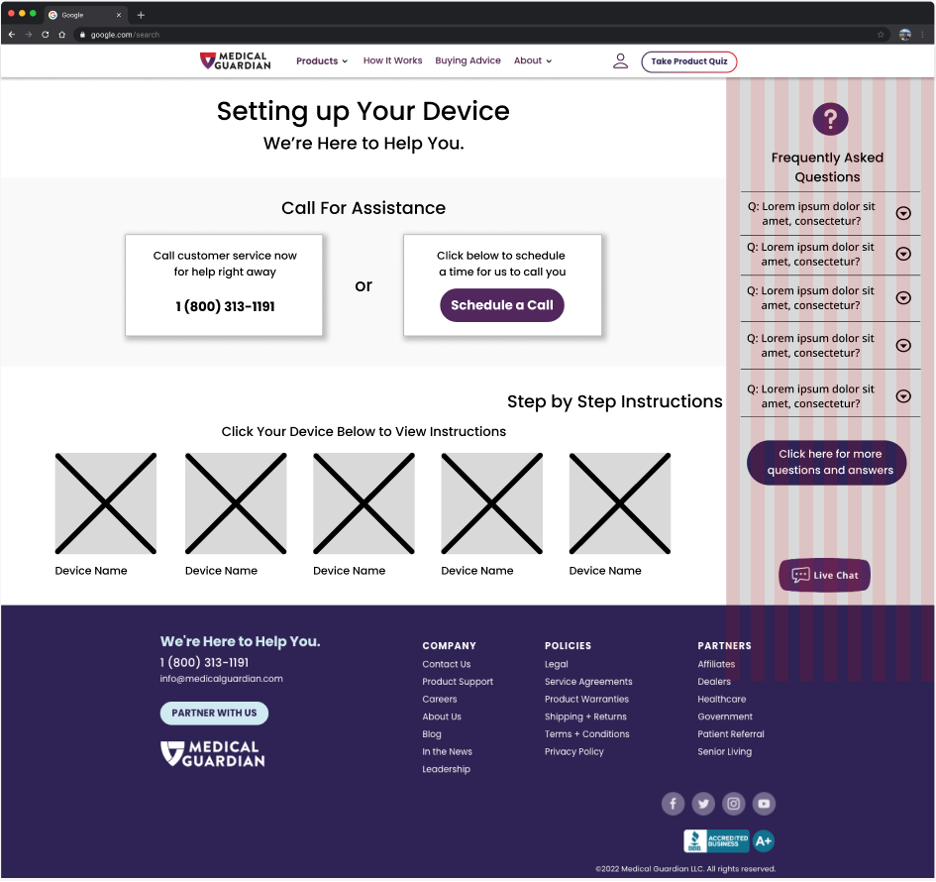
Initial wireframe of activation webpage

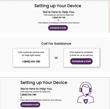
Mockups of webpage heading

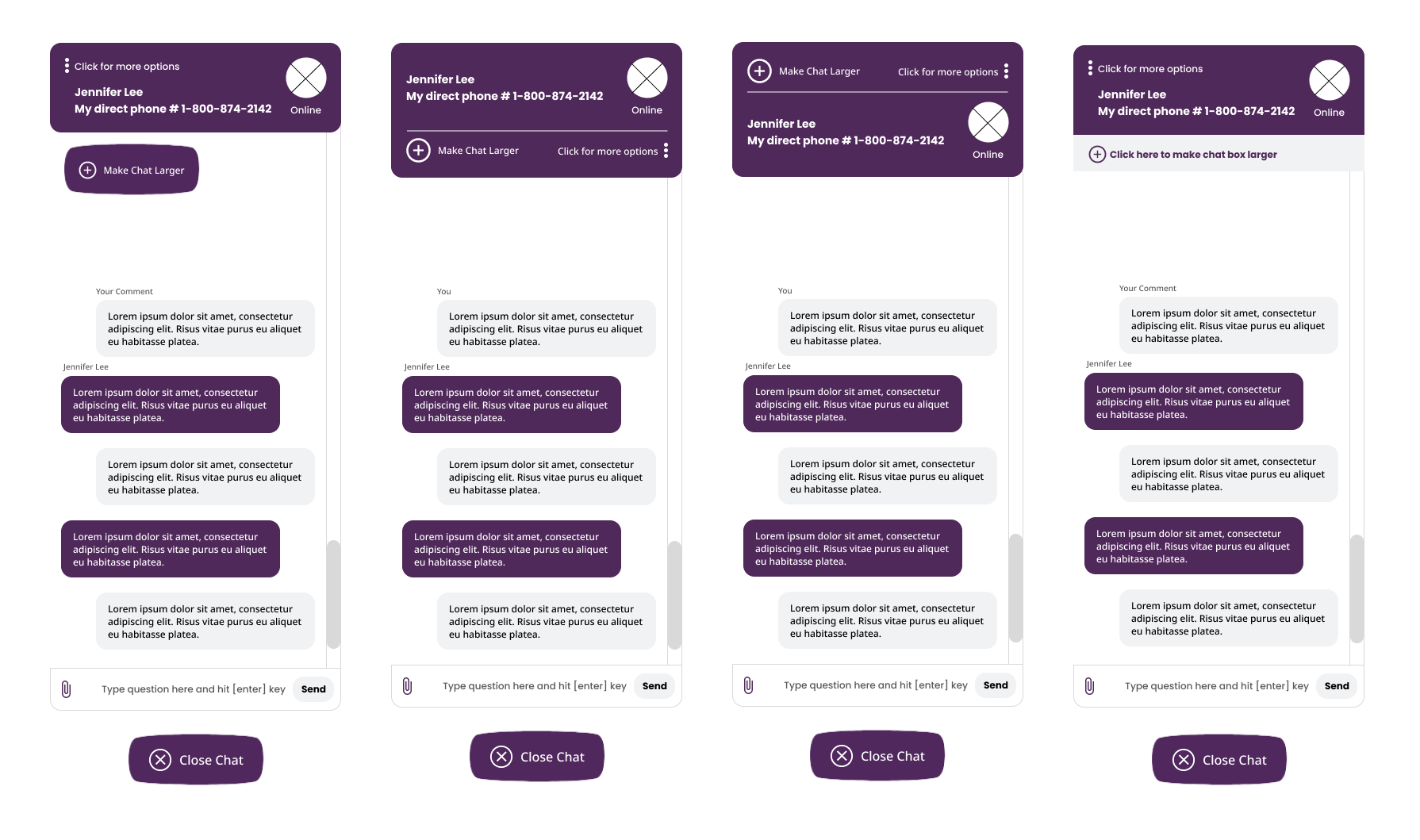
Mockups of live chat function
Usability tests of the grayscale wireframe were then conducted through Figma with two users of the target population. The testers were given the following scenario with usability results below:
You received your MG Move medical life alert device in the mail and wish to set it up through Medical Guardian’s webpage.
How would you proceed with setting up your device?
Where would you look to find the following methods of assistance:
1. Digital instructions
2. Live chat with customer representative
3. FAQ section
4. Plan a call with customer representative
testing the design
4
Success
2/2 successfully discovered the following features on the first try:
Digital instructions
Live chat
FAQ section
Scheduling a call
2/2 successfully navigated each step in digital instructions
2/2 successfully scheduled an appointment for a follow up call
Pain Points
2/2 users stated that it was not immediately intuitive to scroll down to find the digital instructions
1 user commented that the text font was too small
1 user did not know how to close the chat box
1 user did not see the appeal of scheduling a call with a representative
Additional Takeaways
1 user stated that they would use FAQ as a last resort
1 user commented that there were too many options on the screen
After implementing the above user research, the appropriate changes were implemented into the final mockup features, seen below.
a completed updated activation page
5
After intense research, ideation, and design, Medical Guardian’s activation page prototype was created through Figma! Note the multiple avenues a user can take for assistance, including scheduling a call, viewing digital instructions, reading frequently asked questions, and typing to a live customer service representative.
6
what’s next for medical guardian?
Thanks for joining me on this journey! With more time and further research, here are some thoughts of what I would work on next to improve this project:
Conduct more usability tests with our target demographic
Recreate the Medical Guardian homepage design with an easily accessible link to the support page
Create option for video call assistance on the activation page
Incorporate more accessibility features to reach other populations with impairments


